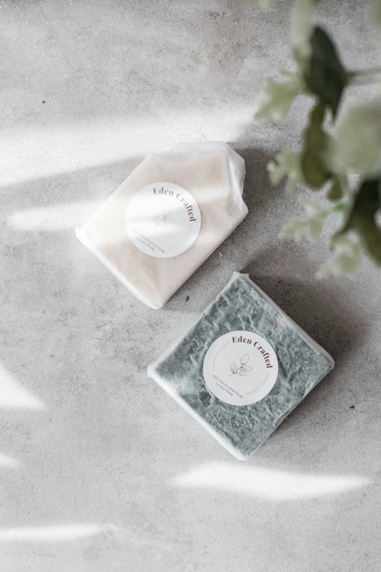
"I uploaded the most beautiful photo of my product — perfect lighting, clean background, great composition. Then I checked Etsy on my phone and half my product was cut off. I had no idea why."
If that sounds like you, you are not doing anything wrong. This is one of the most common frustrations among Etsy sellers right now — and almost nobody talks about it clearly. The root cause is something most sellers don't realise: Etsy doesn't show your photo the way you uploaded it.
Etsy automatically crops your listing photo into different shapes depending on where it's being displayed. Your product could look perfect in one place and completely cut off in another — and it's the same file, the same upload, the same photo.
This guide explains exactly what's happening, why Etsy does it, and — most importantly — how to fix it before your next upload so your photos look great everywhere.
The problem: Etsy uses four different crops
Here's the thing nobody tells you when you first open your Etsy shop. When a buyer searches for something and sees your thumbnail, Etsy is showing a square (1:1) crop of your photo. When they click through to your listing page on desktop, Etsy switches to a landscape (4:3) crop as the main hero image. When they're browsing on their phone, it switches again to a portrait (4:5) crop.
That's three completely different versions of the same photo, shown to the same person in the space of a few seconds. And if your product sits too close to the edge of the frame in any direction — it gets cut off in at least one of them.
Notice how the shape changes drastically between a square search result and a tall portrait on mobile. If your product fills the full frame of the photo, it will be cropped out somewhere. Every time.
Etsy officially recommends avoiding square crops and instead uploading horizontal or landscape images as your first listing photo. A horizontal image uses more of the available thumbnail frame. Portrait images require more content to be cropped out. Your first photo also dictates the shape of photos that follow — so the orientation you choose for image one sets the template for your whole listing gallery.
Why this got worse in 2024–2026
Etsy updated their listing display layout in 2024, shifting the main listing page from a square-dominant display to a landscape hero image on desktop. Sellers who had been shooting beautiful square compositions for years suddenly found their photos looked wrong on desktop. And with mobile traffic growing every year, the portrait crop on phones is catching more and more sellers off guard.
The result? In 2026, there are more ways for your photo to look wrong than ever before. Sellers are spending money on photography only to have their images displayed badly — not because the photo is bad, but because nobody showed them what Etsy would do to it.
How to fix it: the 3-step approach
The good news is this is completely fixable. You don't need to reshoot. You don't need expensive software. You just need to know what to look for — and to check before you publish.
Always shoot your first photo in landscape or square orientation
This is actually Etsy's own recommendation — and it matters more than most sellers realise. Your first listing photo sets the shape template for all photos that follow. If you upload a portrait-oriented first photo, the rest of your gallery will follow that shape — creating an inconsistent, cramped browsing experience. Landscape or square first photos also ensure the centre focal point appears correctly in thumbnail views across Etsy. When in doubt, shoot wider and horizontal.
Shoot further back than you think you need to
This is the single most practical piece of advice for Etsy photography. Take your photo from further away than feels natural. You can always crop in during editing — you cannot add space back in. Shooting with extra negative space around your product gives Etsy's crop algorithm room to work, and gives you flexibility to reposition the focal point after the fact. A photo that feels "too wide" when you take it is almost always the right call for Etsy.
Keep the most important part centred
All of Etsy's crop formats are centred crops — they work inward from all four edges. A subject placed dead centre of the frame survives every format. Make sure the most important part of your product is focused in the centre with enough border on all sides that it can be cropped to square, portrait, and landscape without losing any of it. If your product has a key detail — a label, a texture, a face — that detail should sit in the centre third of the frame.
Keep your photos consistent across the whole listing
Etsy recommends uploading photos of the same orientation for all images in a listing. Mixing portrait and landscape photos in the same listing creates a disjointed, unprofessional gallery experience for buyers. If your first photo is landscape, keep all photos landscape. Consistency across your listing photos creates a more cohesive browsing experience — and a more trustworthy impression of your shop.
Preview all four crops before you publish
Etsy has a built-in thumbnail adjustment tool inside the listing editor — but it only shows one format at a time and many sellers never find it. The fastest way to check all four formats simultaneously is to use a dedicated preview tool before you upload. See exactly how the crop looks in 1:1, 4:3, 5:4, and 4:5, drag to reposition if anything is clipped, and only then upload the final file. This takes 60 seconds and can save you from republishing a listing.
The tool that solves this in 60 seconds
Most sellers don't realise their photos are being cropped badly until they've already had views — or worse, until a customer mentions it. The problem is that there was no simple way to check before publishing. Etsy's own thumbnail tool inside the listing editor only shows one format at a time, and most sellers never even find it.
That's the exact gap Wrenkit was built to fill. Upload your photo, see all four crop formats instantly, drag to reposition, and only then upload to Etsy. The whole thing takes under a minute — and it means no more guessing, no more re-uploads, no more finding out something looks wrong after you've gone live.
See every crop before you list
We know how it feels — you spend time getting the perfect shot, upload it to Etsy, and then realise it looks completely different on mobile. Or a customer screenshots your listing and the product is half cropped out. It's frustrating, and it's fixable. Wrenkit was built specifically for this problem.
The right image sizes for Etsy in 2026
Now that you understand why the crops happen, here are the exact dimensions to keep in mind when shooting and editing your listing photos.
Don't overthink the numbers. Just upload at a minimum of 2000px on the shortest side, keep your subject centred, leave breathing room around the edges, and preview all four crops before publishing. That covers everything.
Your pre-upload checklist
Print this out, screenshot it, or save it somewhere you'll see it next time you're about to upload a listing photo.
Quick answers to common questions
Can I upload different photos for mobile and desktop?
No — Etsy uses the same image file for all crop formats. You cannot upload separate versions for different contexts. This is exactly why previewing your single photo across all formats before uploading is so important.
Why does my first photo look different from the rest?
Etsy treats your first listing photo as the primary image — shown in search results, on your shop page, and as the main hero on your listing page. It gets the most cropping variation of any photo in your listing. Always give it the most attention.
My photo looks fine on desktop but bad on mobile — why?
Desktop uses a 4:3 landscape crop for the main listing hero. Mobile uses a 4:5 portrait crop — taller and narrower. If your subject sits in the upper or lower portion of the frame, the mobile portrait crop will clip it. The fix is to centre the subject vertically and leave space above and below it.
What's the best file format for Etsy photos?
JPG in almost every case. Export at 85–95% quality, sRGB colour profile. For graphics or images with transparent backgrounds, use PNG. Avoid CMYK — it will look desaturated on screen.